I have decided to change my poster, as I feel that the current one does not look particularly apealing, and also the point doesn't relate that well at first glance, because the writing is difficult to understand. Though I feel that the subject of value for money would still be a good point to work on.
This is my current poster:

"I think the idea is good but it doesn't relate onto design.It is difficult to read the red writing and the pictures don't work together." - Elizabeth Riley
"You need to make sure the audience understands what your trying to say, and this poster doesn't communicate that" - Mrs Whiers
"It's not clear as there are too many overlapping words and it is't eyecatching" - Erica Hodgson
-------------------------------------------------------------------------------


Here of my screenshots of the poster:

Until I took pictures of what 75p actually looks like, I simply inserted an image from Clip Art for the time being

So I could get a feel of what the end product was going to look like, I roughly put some lines onto the poster to see which looked right.

I then proceeded to add the words in a curved effect to add interest to the poster as straight lines looked too uniform and dull.

Once I had added the words in I then filled them with colour. I feel that the teal colour fits because it is the same colour as the masthead, and the orange and blues complement it well.

After finishing the previous words and colours, I thought that the poster didn't have enough words in it and they were too big and didn't give off the look I wanted to create (almost looking like fireworks).
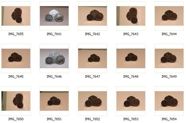
After this I then took photos of 75p:
Obviously I had to edit one of the images so that it would fit and look right on the poster:

I selected the outline of the coins with the Magnetic Lasso on Adobe Photoshop Elements.

Then, I inversed the selection and deleted the background, as the coins are all I need in the image.

I then used the Eraser tool to neaten the edges.

I cropped the image closely to make the size of the image smaller and to avoid unneccessary space.

I then used the Colour Variations to reduce the reddy/orange colour and give the pennys a more silver look to them.

To enhance the silver colour even more, I reduced the red saturation.
All this resulted in the final image:

I then proceeded to insert thi in my poster:

Firstly, I had to get rid of the Clip Art.

I had to resize the image as it was far too big for the page

Finally, I changed around the words to make them fit around the image and then changed the 'Sports' colour to the teal colour because I felt that otherwise it looked a little too dark.
Here is the final image:

Overall, I am very pleased with how different it looks to the original poster, but also generally how it looks.
