Poster Rework

I have decided to change my poster, as I feel that the current one does not look particularly apealing, and also the point doesn't relate that well at first glance, because the writing is difficult to understand. Though I feel that the subject of value for money would still be a good point to work on.

This is my current poster:


For me, the design just simply doesn't work and after receiving audience feedback I have decided to re-work it. Here is some audience feedback:

"I think the idea is good but it doesn't relate onto design.It is difficult to read the red writing and the pictures don't work together." - Elizabeth Riley

"You need to make sure the audience understands what your trying to say, and this poster doesn't communicate that" - Mrs Whiers

"It's not clear as there are too many overlapping words and it is't eyecatching" - Erica Hodgson

-------------------------------------------------------------------------------

I liked the idea of focusing on the price of the newspaper, and the "the best 75p you'll ever spend" slogan, so I am going to try and keep some form of that in the poster. What my poster needs to be is colourful, eyecatching and informative on what the poster includes. I did try and include the latter on my previous poster but sadly it didn't work with that design. I am also going to make the poster inspired by The Guardian newspaper advertising campgain posters, for example:


Here of my screenshots of the poster:

 Until I took pictures of what 75p actually looks like, I simply inserted an image from Clip Art for the time being


So I could get a feel of what the end product was going to look like, I roughly put some lines onto the poster to see which looked right.

I then proceeded to add the words in a curved effect to add interest to the poster as straight lines looked too uniform and dull.


Once I had added the words in I then filled them with colour. I feel that the teal colour fits because it is the same colour as the masthead, and the orange and blues complement it well.

After finishing the previous words and colours, I thought that the poster didn't have enough words in it and they were too big and didn't give off the look I wanted to create (almost looking like fireworks).
After this I then took photos of 75p:


Obviously I had to edit one of the images so that it would fit and look right on the poster:


I selected the outline of the coins with the Magnetic Lasso on Adobe Photoshop Elements.

Then, I inversed the selection and deleted the  background, as the coins are all I need in the image.

I then used the Eraser tool to neaten the edges.

I cropped the image closely to make the size of the image smaller and to avoid unneccessary space.

I then used the Colour Variations to reduce the reddy/orange colour and give the pennys a more silver look to them.

To enhance the silver colour even more, I reduced the red saturation.


All this resulted in the final image:


I then proceeded to insert thi in my poster:

Firstly, I had to get rid of the Clip Art.


I had to resize the image as it was far too big for the page

Finally, I changed around the words to make them fit around the image and then changed the 'Sports' colour to the teal colour because I felt that otherwise it looked a little too dark.

Here is the final image:


Overall, I am very pleased with how different it looks to the original poster, but also generally how it looks.

Technological Devices Used

Throughout the whole process of creating a newspaper, newspaper website and newspaper website, I have used the following programmes and websites:

  • Google
        - This website is used to research other newspapers, find images etc.
  • Weebly
        - I initially used this website to create my newspaper website, but found it too confusing to use
  • Photoshop Elements 3.0
        - I use this programme to edit my images
  • Microsoft Publisher
        - This programme was used to create and edit my newspaper
  • Microsoft Word
        - I am constantly using this programme for many different reasons; to write down notes on newspapers, websites etc, or to edit my 'footer' images for my website (e.g. 'Competitions', 'Reader Panel' etc)
  • Paint
        - I used this programme for print screen images, editing and cropping images.
  • Blogspot
        - This is the website used for my blog
  • Microsoft Office Live Small Business
        - The is the website I am using for my newspaper website

Photo contact pages and manipulation for my poster

For my poster, I am using my own original images. I am going to crop them on Microsoft Word so that I can get a better idea of whether they are the same size.

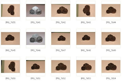
Here is my contact page of images:


To make the images stand out a bit more I edited them on Photoshop Elements 3.0. I didn't edit them extensively because I just want a natural look to them.


Poster layout

This is my inital poster layout. My aim was to appeal to the audience by focusing on the price. As of yet these are not my own pictures (apart from the image of the newspaper), as I will insert some later.


Research for Newspaper Posters

For the newspaper poster/advert I am going to make, I have been reasearching national newspapers adverts. The ones I have found so far are:


Generic conventions:
-1 Main image
-Not a lot of text
-Involves the newspapers website
-Eyecatching
-Tells you what is unique about the newspaper
-'Value for money' is a technique used to sell the paper
-General tone is serious
-Pronouns to involve the audience
-Name of the newspaper
-Isn't gender or age specific


Something that I've found is that there is a basic formula needed when it comes to advertising, as the whole point is for your product to get noticed, and if it looks similar to everything else then it blends in and goes unnoticed, which completely defeats the point. It is also best if the poster is non gender-specific, doesn't include people and isn't age specific.

Newspaper website

I have decided that I will use Microsoft Office Live as the host of my website for the newspaper. I created sites with Google Sites and Weebly, but these proved to be too simplistic-looking for what I would like. My newspaper website domain is :
http://www.theharrogategazetteweekly.web.officelive.com/

Before I actually created the website, I made fake adverts for the website to make it seem more authentic;


I created this in Microsoft Word by creating a heart shape with the 'Shapes' tool, then including text into it, then I retrieved an image from Clip Art on Microsoft Word and placed it next to the heart, then created a fake website name.


This was created in a similar way by first of all using the Shapes tool on Microsoft word, then adding Word Art and text, then including Clip Art from Microsoft Word.


I created this image by first of all taking an image of a newspaper (it wasn't local, but because I was not focusing on the actual content of the newspaper because it was just a background I didn't think it should matter) then cropping it and putting a border round it. Then, for the 'More' button i used the Shapes tool on Microsoft Word and made a rectangle then included an arrow from Clip Art and added text to it. Finally, I added Word Art on top of the image.


A few of these 'advert's were inspired by images that are already on the Harrogate Advertisers website:


Comparison of newspaper and web page

  • The Main story is reproduced exactly as the newspaper but it includes an opportunity to comment on the article.
  • On the web page there is a feature about a horror film that isn't included in the newspaper.
  • In the web page, there is an update on a previous article which wrote about preparations for a rugby match, which was included in the newspaper. The updated article is about the outcome of the match.
  • There is a repetition of what's on at the cinema during the week.
  • On the web page there is obviously more detail about the newspaper, and there are archives of older articles.
  • Theres a whole block of interactive features which let you either express your viewpoint on a topical issue or vote for an award or entering competitions.
  • The main articles on the website change regularly, unlike the newspaper which cannot be changed
Cohesive devices of the Harrogate Advertiser newspaper and website
  • The first cohesive device that you notice when going onto the Harrogate advertiser website is that the font and colour schemes follow the same rules as the paper.
  • The articles shown on the homepage of the Harrogate Advertiser web page are generally the same as in the newspaper
  • There is also a hyperlink to an article with the heading "Harrogate News", to further confirm that it is local.

website for the Harrogate Advertiser - http://www.harrogateadvertiser.net/

Newspaper website conventions

I am now to produce a website for my newspaper. To help with research and to find generic conventions of a local newspaper website, I have looked at other webites and listed to generic conventions I found;

  • Advertisements
  • Links/hyperlinks
  • List of articles within the newspaper of that week
  • House style
  • Ability to interact with the newspaper, with forums
  • Time and date
  • Scrolling text e.g. current daily news
  • Weather in the local area
  • Links to specific article areas e.g. sport
  • Search boxes
  • Pictures included with articles
  • 'Sign in' and 'Register' options
The websites I looked at were:
Newcastle journal
North Wales Weekly News
Harrogate Advertiser

I was originally also going to look at my other local newspaper websites such as Knaresborough Post, Ripon Gazette and Yorkshire Post, but as all of these are produced by the same publicator, Ackrill Media Group, they all look relatively similar, so therefore they wouldn't be ideal to look at generic conventions, so I widened my search.

Table of articles

This is a table of all my articles within the front page and second page, who the article is aimed at, whether it has a photo, and what the news value(s) is.


Contacts pages for proof that I took my own photos

The reason I chose this picture over all of the others is because the middle part was in focus, so I cropped it so that the focus was mainly on that.


The reason I chose this image is because it is a close-up, and she looks happy.


I chose this image for the stationary shop advert because I think pencils represent stationary well, and it was the best composition of the set.


I chose this image for the advert of the cupcake shop because the composition was the best out of the rest of the pictures


I chose these three photos because they had the best compositin, weren't blured, and had the best light


This photo was chosen because it was the only one that wasn't blurred


I chose this photo because people were doing the best poses in it


This photo was chosen because I thought it represented Knaresborough well


The reason I chose this picture for the advert is because the advert in question was about selling a house, and this image includes all of the house.